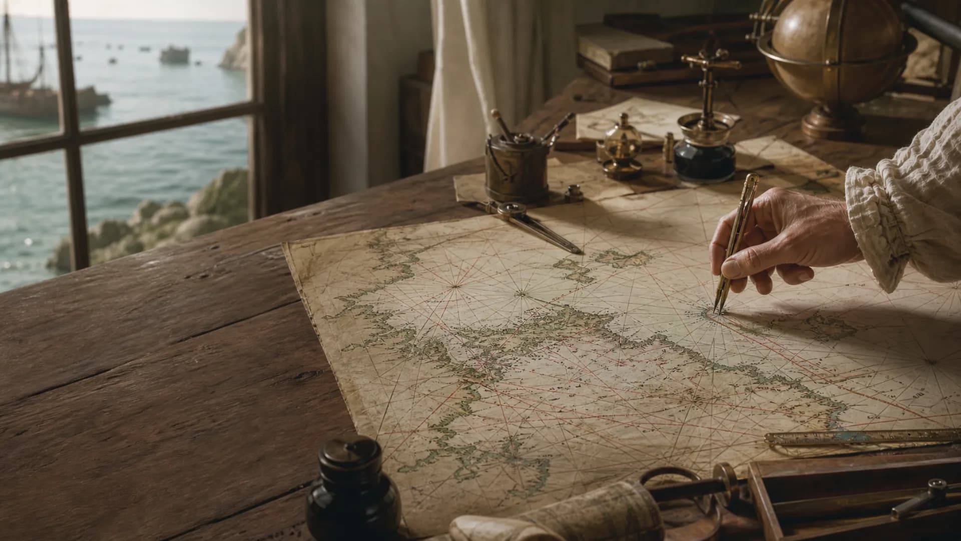
 portolan
A compass line runs into the blank
Ports
Names written along the coast form the voyage nodes.
Compass rose
Radiating points help compare directions between ports.
Rhumb lines
The dense lines are directional references, not recorded tracks.
First ask what job the chart was made to do
An early chart invites us to look at it as a picture: the parchment has darkened, coastlines crowd the surface, and figures or monsters occupy the open water. Yet the first useful question is not, ‘What is that creature?’ It is, ‘Who was this chart made for, and where was it meant to be used?’
Portolan charts, which appeared in the late Middle Ages, concentrate on coasts and ports. Place names run along the shore while inland areas may remain almost empty. That selection suits coastal and Mediterranean voyaging; it does not turn the chart into a modern projection ready for an ocean crossing.
A chart’s physical life matters too. A working copy may bear folds, stains and wear from use at sea. A version made for a court or collector may use richer materials and elaborate ornament. Rather than search for one universal key to every old map, begin with its date, coverage, material and catalogue history.
The crossing lines are not a record of ships’ tracks
Once the eye moves beyond the coast, it meets the densest feature on the sheet: straight lines radiating from compass roses or regularly placed points. Their intersections resemble the wakes of countless voyages. It is a persuasive impression—and often the wrong one.
These are usually called compass lines or a rhumb-line network. A pilot could use them to compare the approximate compass bearing between ports and relate direction on the chart to a compass reading aboard ship. They form a reference network, not proof that a vessel sailed every line, and they are not a modern latitude-and-longitude grid.
Return to the shore and the chart’s priorities become clearer. Port names are often written at right angles to the coastline, with important places picked out in colour. The coast is crowded while the open sea remains sparse because the chart is built to recognize shores and connect ports.
Read the monsters last: they belong to knowledge and imagination alike
Sea monsters are often the first details a modern viewer notices, but they make more sense at the end. Once we know whether a chart served navigation, collecting or political display, the creature’s location and purpose are less likely to be read in isolation.
A monster might warn of unfamiliar waters, occupy a visual blank, display the mapmaker’s skill or reinforce a patron’s vision of the world. Such figures are valuable evidence of maritime imagination, but they are not modern biological surveys—and one image does not prove that its maker saw the animal.
To ask where a creature came from, place the chart beside contemporary travel writing, religious texts, natural histories and other images. A cropped detail passed around online may preserve the strangest figure while removing the context that explains it.
Questions
Continue exploring this subject
Why do early charts contain so many crossing lines?
Many belong to a compass-line network used to compare directions. They are navigational references, not a modern coordinate grid and not necessarily records of actual routes.
Do sea monsters prove that sailors saw them?
No. A figure may draw on legend, transmitted texts, decorative practice or an exaggerated real animal. Its meaning depends on the chart and its context.
Do old charts always put north at the top?
No. North-up orientation was not universal. Text direction, compass roses and place-name placement help show how a particular chart was meant to be viewed.
Sources
Continue the research
- Portolan ChartsLibrary of Congress
- Nautical ChartsLibrary of Congress